Trustpilot · Design system and rebrand
Making a marketing rebrand work in product, across 18 teams
Trustpilot rebranded with an identity an external studio had designed for marketing. None of it had been designed for screens or checked for accessibility. I led design of the design system that carried it into the product.
- Role
- Senior Product Designer, Design Systems
- Dates
- Nov 2021 to Mar 2023
- Team
- Systems team grew from me and one engineer to two designers and three engineers
- Scope
- Advised ~30 designers across 18 product teams
- Status
- Shipped
The problem
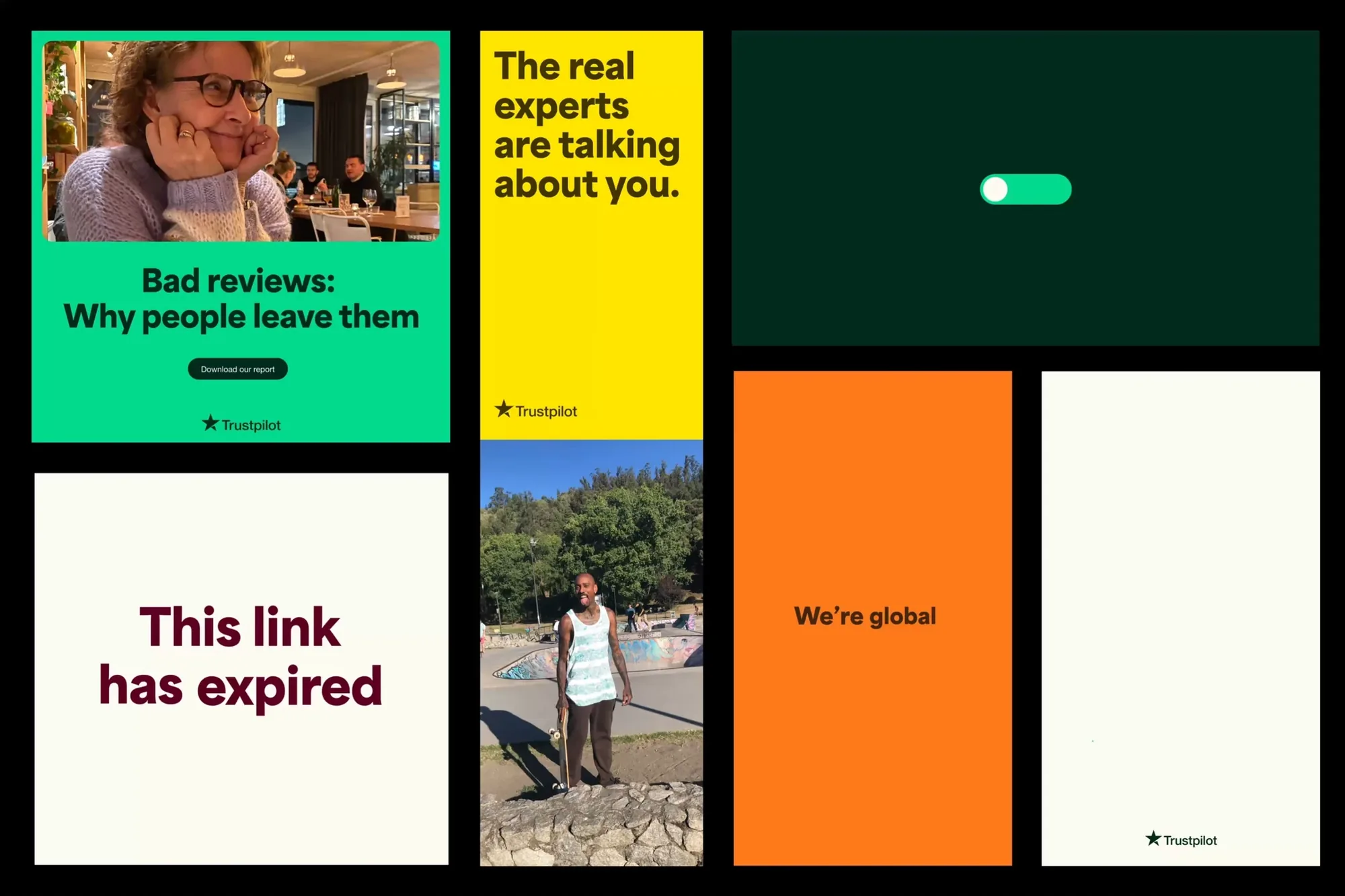
The new brand was strong on posters and in campaigns. In product it raised questions nobody had answered. Which colours can carry text? What does the brand look like in a dense settings page, or in an error message? Nothing had been checked against accessibility standards.
At the same time, around 30 designers across 18 product teams would each answer those questions differently if left alone. The brand would fragment as it shipped.
So there were two jobs: decide how the brand should work in product, and get 18 teams to use the same answer.
Constraints
- A brand already launched. We could adapt how it was applied in product, not redesign it.
- Accessibility. The system targeted WCAG 2.1 AA, so brand colours and type had to earn their place in UI.
- Influence, not authority. I advised the product teams; I didn't manage them. Adoption had to be earned.
My role
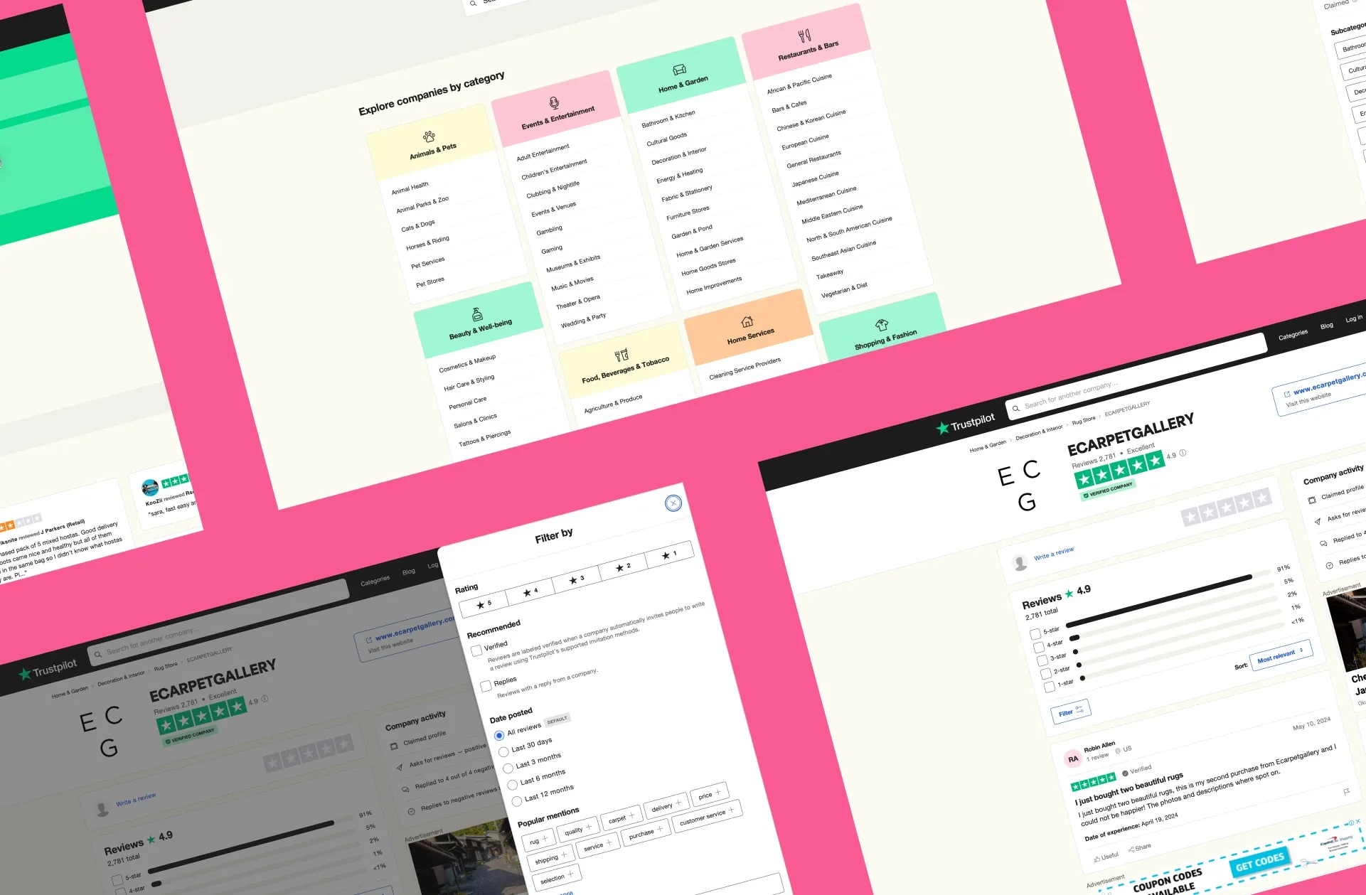
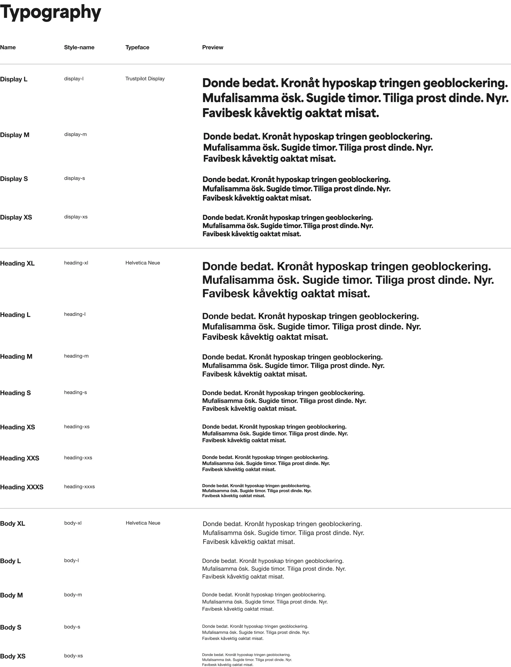
I led all design aspects of the system: tokens, components, icons, documentation and contribution rules. I ran the workshops, set the rules for applying the brand, and worked with engineers on how the system reached code. I also supported the mobile app team with iOS components built on the same tokens.
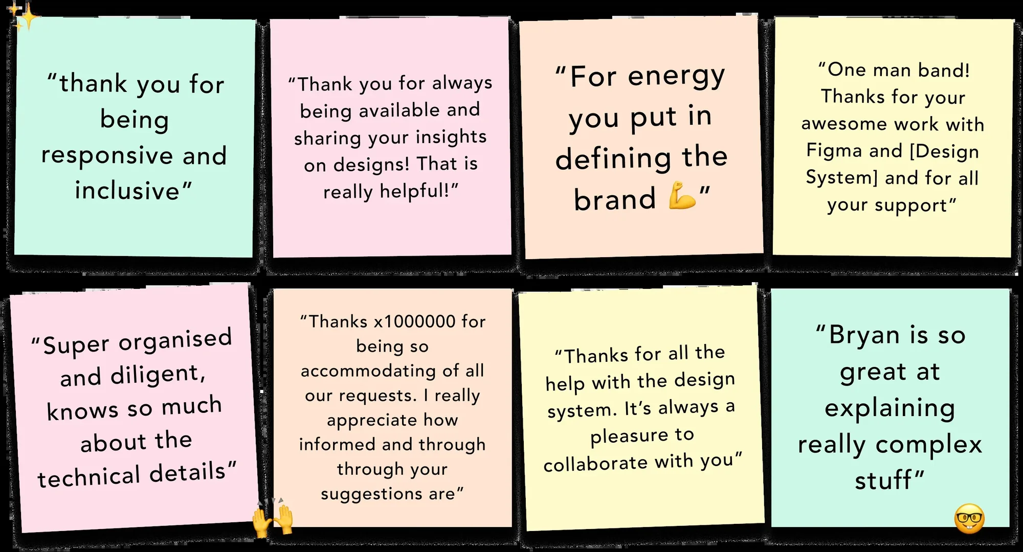
“I’m very grateful we found Bryan for his role in the team - his experience, structured approach and calm personality was exactly what we needed.”
 Mads Godvin Jensen, worked with Bryan on the design system team
Decision 1: decide the brand's product rules together
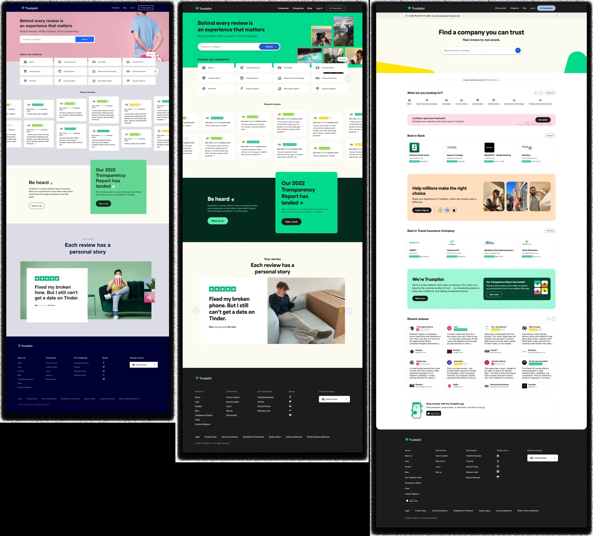
Rather than publish rules from the systems team, I ran workshops with design teams to work out how each brand element should apply to product. We started from how the existing product was used and from the information Trustpilot wanted to put first, then decided where the brand should be loud and where it should step back.
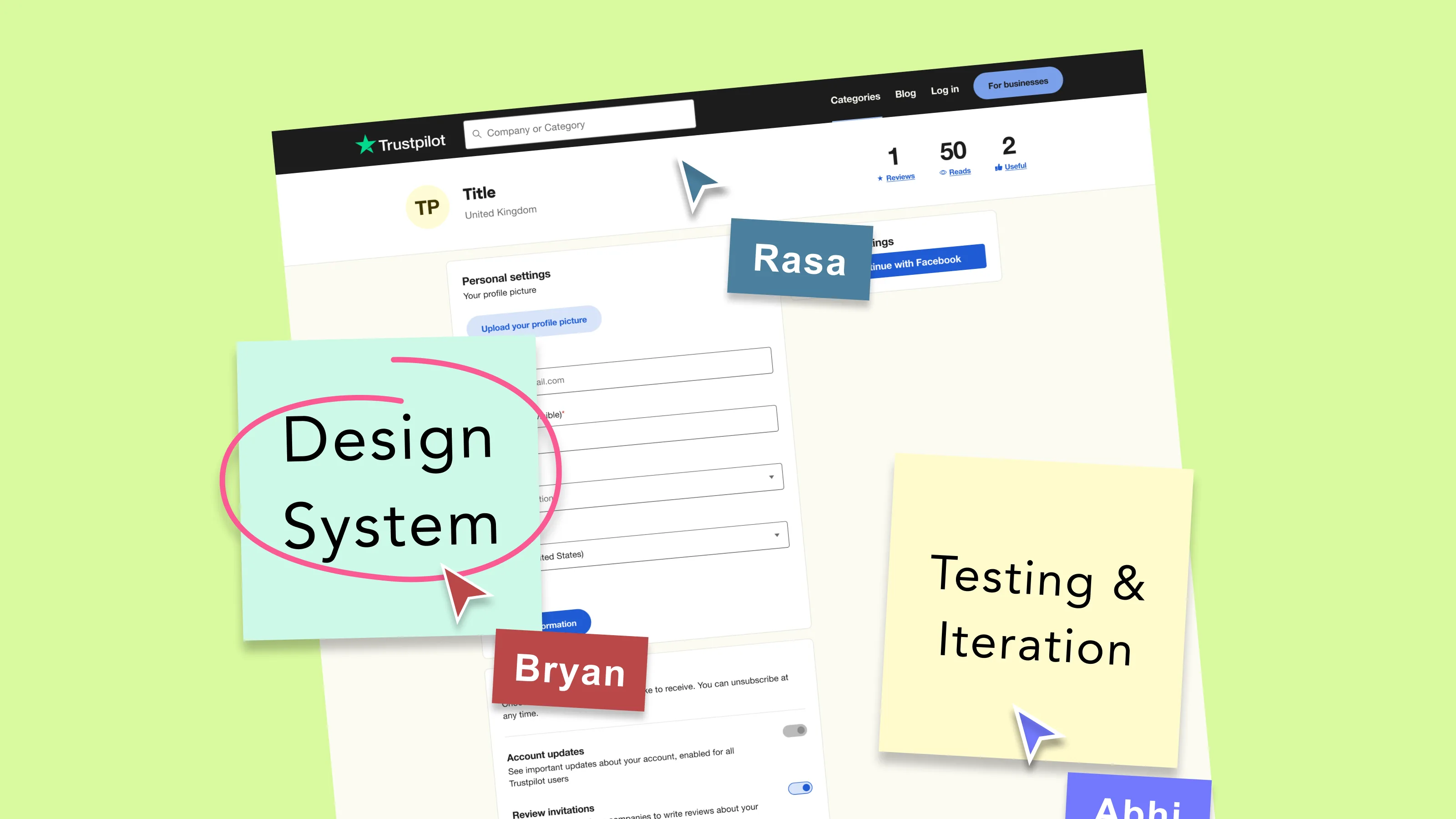
I also ran regular workshops on how to use the components in Figma.
Decision 2: accessibility decides how brand colours are used
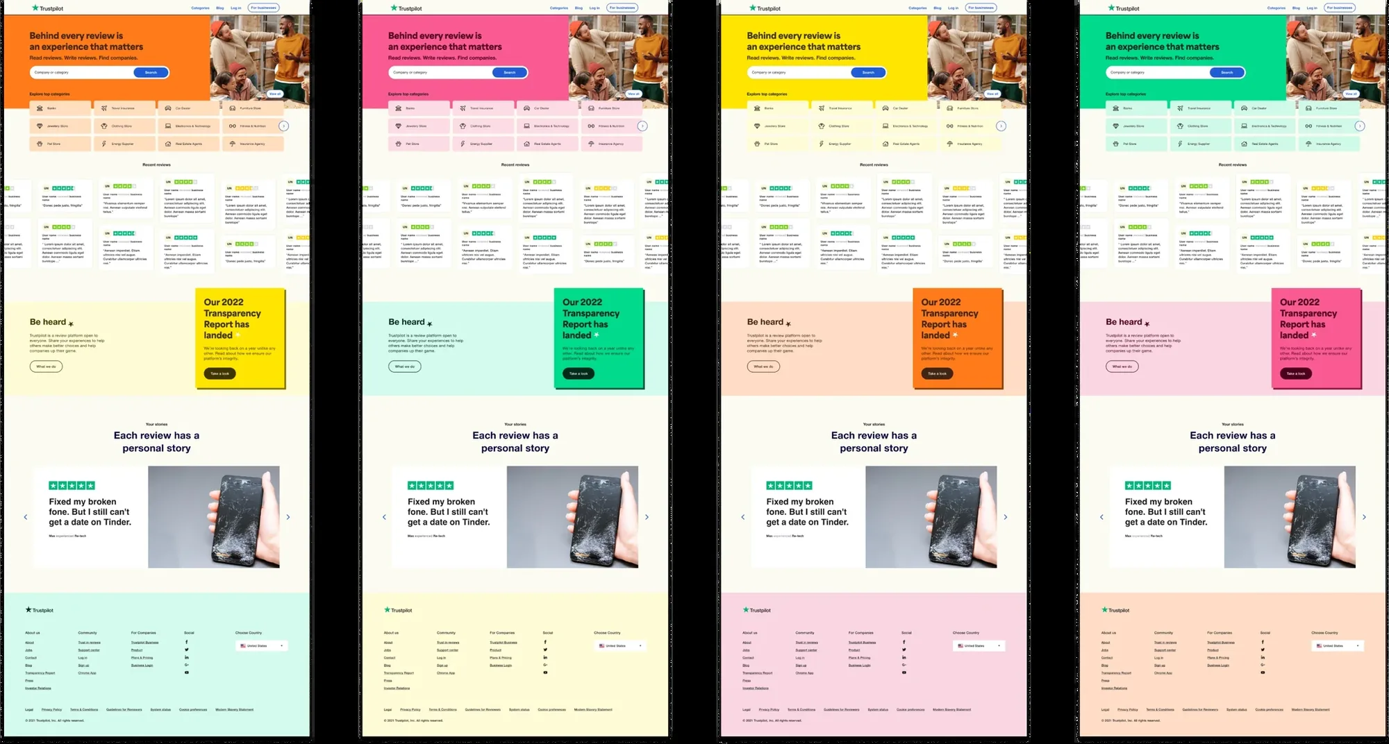
Some brand colours worked as shapes and backgrounds but not as text. Rather than drop them, the system defined where each could be used, and paired them with shades that pass AA for text and interactive states.
Marketing use, applied to UI
Product use, defined in the system
Decision 3: treat adoption as the product
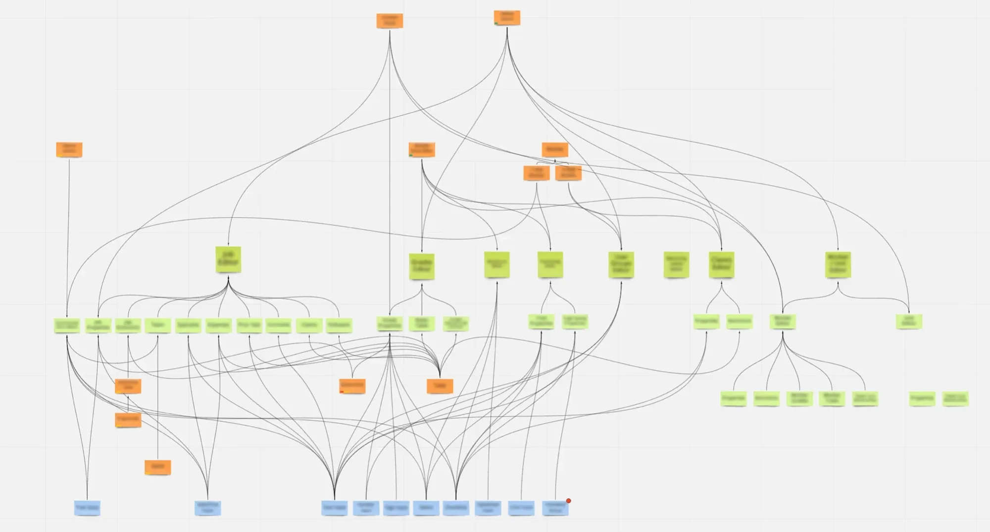
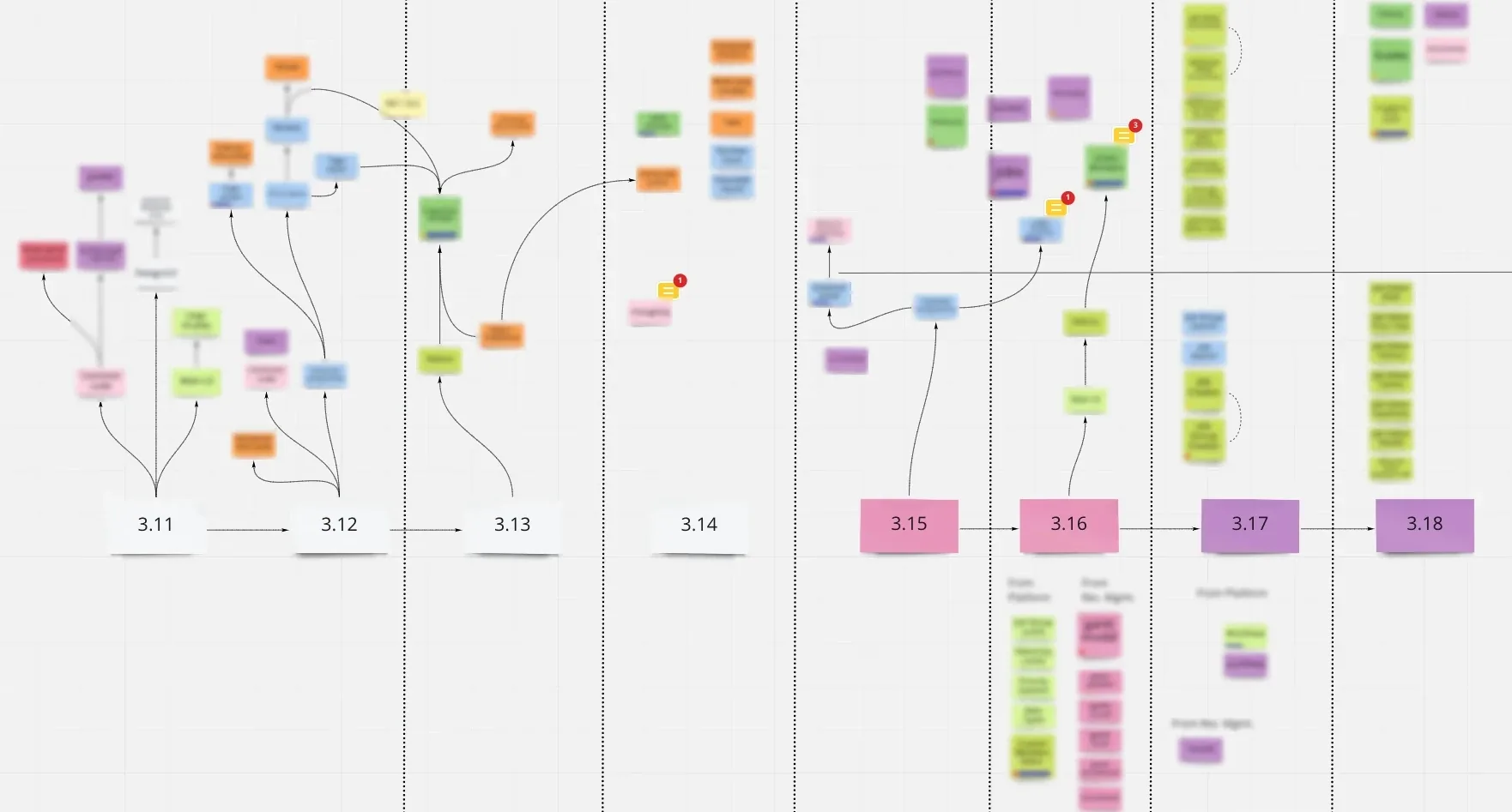
A system nobody uses is a library. I set up a centralised contribution model with documented rules, so teams could propose changes without the system splintering. Work-in-progress reviews caught problems early, workshops explained the reasoning, and regular SUS surveys told us how designers felt about using it. Support for the system reached CEO level.
How a change moved through the system:
- Propose. Teams bring a need or a component.
- Review. Work-in-progress reviews with the systems team.
- Document. Usage rules, do and don’t, and accessibility notes.
- Release. The Figma library and the code package ship together.
- Learn. Workshops, questions and regular SUS surveys feed the next proposal.
What it became
“His usability and interaction expertise, supported by his visual acumen, front-end knowledge, and supportive, diligent approach, ensured Trustpilot’s Design System was built for success.”
 Alexandre Navarro Caldeira, worked with Bryan on the design system team
Under the hood: tokens
Engineers needed the same decisions in code, without copying values by hand. I set up a token pipeline from Figma through Tokens Studio and Style Dictionary, published to GitHub as an npm package.
Tokens came in two tiers. Primitives were named by luminosity (neutral 100, 200, 300). Semantic aliases were named by purpose (text primary, foreground primary, background primary). We planned a component tier but didn't need it.
Primitives, by luminosity
neutral 100neutral 300neutral 600neutral 900Semantic aliases, by purpose
text primary | neutral 900 |
background primary | neutral 100 |
border default | neutral 300 |
A small, practical win
Figma bills seats quarterly. I introduced a quarterly audit that removed seats inactive for two to three months before each true-up. It saved $24,000 over six months, and finance and administration later took it on as standard practice.
Outcome
- One design system used by 18 product teams, carrying the new brand into product.
- I contributed to Trustpilot's rebrand, which won Best Internal Rebrand and the Judges Award at the Inside Out Awards 2023.
- I hired the second designer on the systems team.
What I'd do differently
We tracked satisfaction with SUS surveys, but the scores weren't kept in a way I can show today. Next time I'd keep a simple record from the start: SUS over time, and how much of each product's UI comes from the system. Adoption is the outcome of a design system, so it should be measured like one.