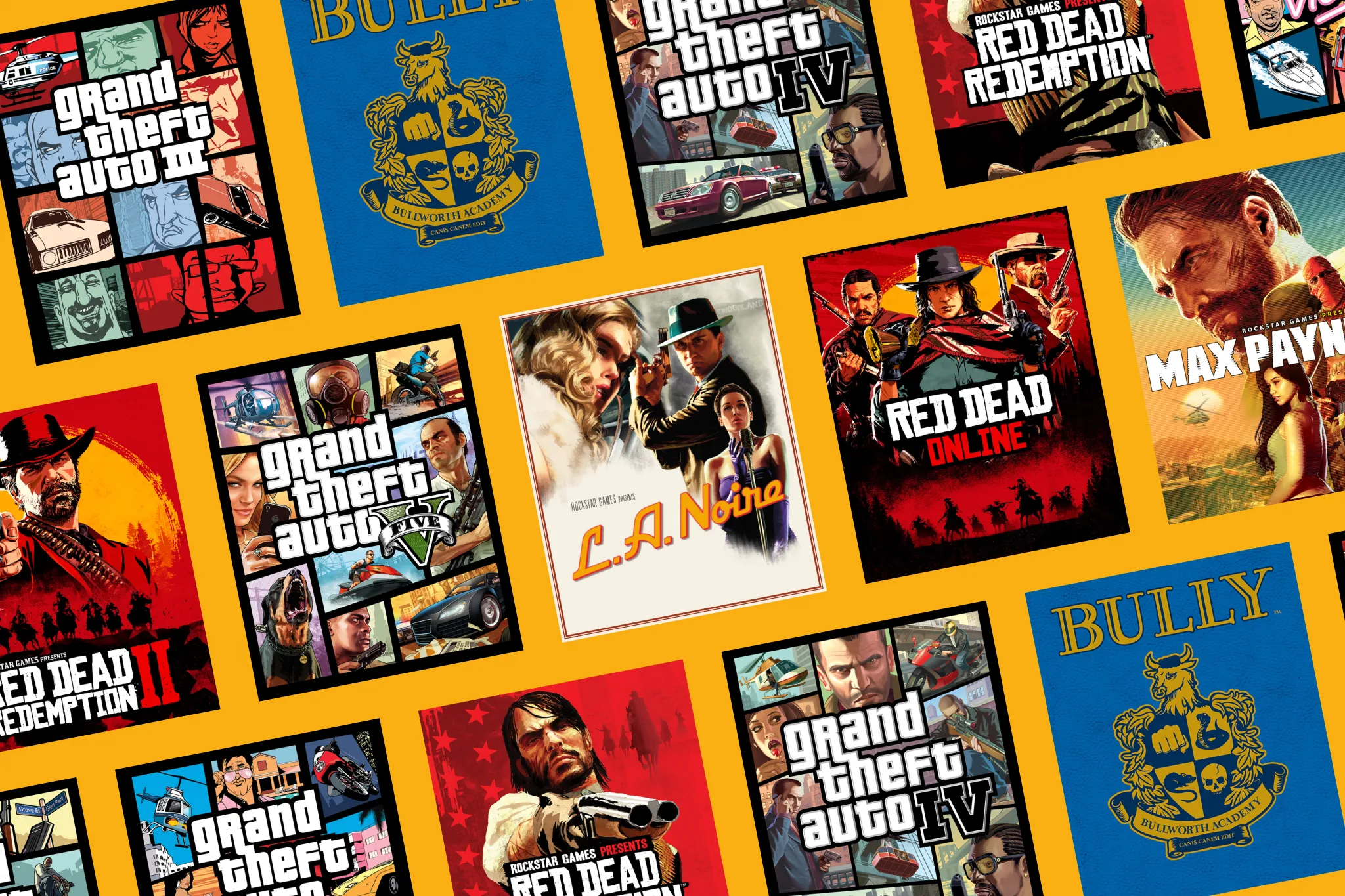
Rockstar Games · Rockstar Games Launcher
A launcher players open for their games, not for adverts
Rockstar wanted its own desktop launcher, so players could manage their games and buy new ones directly. I designed it and built its frontend, on a team of three.
- Role
- Web Developer: UI and UX design, and frontend development
- Shipped
- September 2019
- Product
- Rockstar Games Launcher, a Windows app for a player’s game library and Rockstar’s own store
- Team
- A lead developer, me on design and frontend, and later a second frontend developer
- Built with
- Figma, Adobe XD, React
- Status
- Shipped, and still in use
The problem
Games sold through third-party storefronts give up a commission on every sale, typically up to 30%, including in-game purchases. A sale that keeps 70 of every 100 through a store keeps close to the full 100 when it is sold directly, before payment costs.
Rockstar wanted a desktop launcher of its own: one place to log in, manage a game library, launch games and buy new ones from Rockstar directly. It had to:
- Keep revenue in house through direct digital sales.
- Make the journey from login to launch, and to purchase, feel effortless.
- Hold up under load alongside major game releases.
Constraints
- Many inputs and screens. Players would use a keyboard, a mouse or a game controller, on desktop monitors and TVs.
- Many territories. Purchases and content had to meet legal requirements in each market.
- Distance. I worked from Edinburgh with teams in the US. Feedback from marketing came through a producer and could take weeks.
- Confidentiality. Testing with the public before launch wasn’t possible.
- An existing account system. The launcher sat on top of Rockstar’s Social Club accounts.
My role
My title was Web Developer. The studio had no dedicated web designers, so I did both: user flows, interface design and prototypes, then the React code that shipped. I ran the competitor research and worked with engineers, QA, legal and marketing throughout.
What I designed and built:
- A component library for the launcher, themeable with CSS custom properties. That was 2018, before most design systems worked that way.
- The store, alongside the player’s library.
- The payment flow, in the launcher and the in-game overlay on PC.
- Download management: installing, updating and queuing games.
- The promotional feed, powered by a marketing CMS in Rockstar’s internal admin site.
- The login subdomain, whose API the launcher used to sign players in.
Learning from other launchers
I benchmarked the launchers and storefronts players already used. The pattern was clear: the more a launcher pushed its store, the less it felt like it belonged to the player.
| Benchmarked | What worked | What didn't |
|---|---|---|
| Steam | Rich features, established trust | Data-heavy UI; store comes before the library |
| Epic Games | Generous revenue share, free games | Basic UI, slow updates |
| Battle.net | Streamlined around a few core titles | Limited room to extend |
| Ubisoft Connect | One ecosystem, loyalty features | Cluttered UI |
| Adobe Creative Cloud | Clean layout, modular updates | Steep learning curve for new users |
Decision 1: open on the player’s games
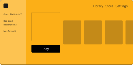
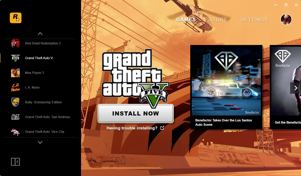
Players open a launcher to play something they already own. So the launcher opens on the library, with the store one step away rather than in front of it. Navigation stayed shallow and worked the same way with a mouse, a keyboard or a controller.
Decision 2: no pop-ups, and something better for marketing
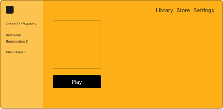
Marketing proposed interstitials and pop-ups to promote new content and in-game currency. I pushed back, using feedback from internal testing and from our competitor research: interruptions were the thing players complained about most, and they would cost us trust and generate support tickets.
Refusing alone wouldn’t have worked, because the business need was real. So I proposed a promotional feed: a set of cards beside the library that marketing could update with offers and news for each title, through a CMS I added to Rockstar’s internal admin site, without ever blocking the player. We agreed it by setting the business goals, player expectations and risks side by side.
Proposed: an interstitial on launch
Shipped: library first, with a promotional feed
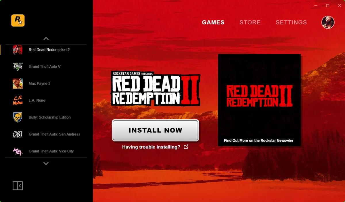
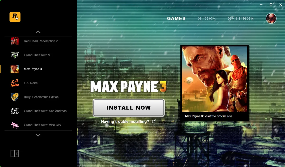
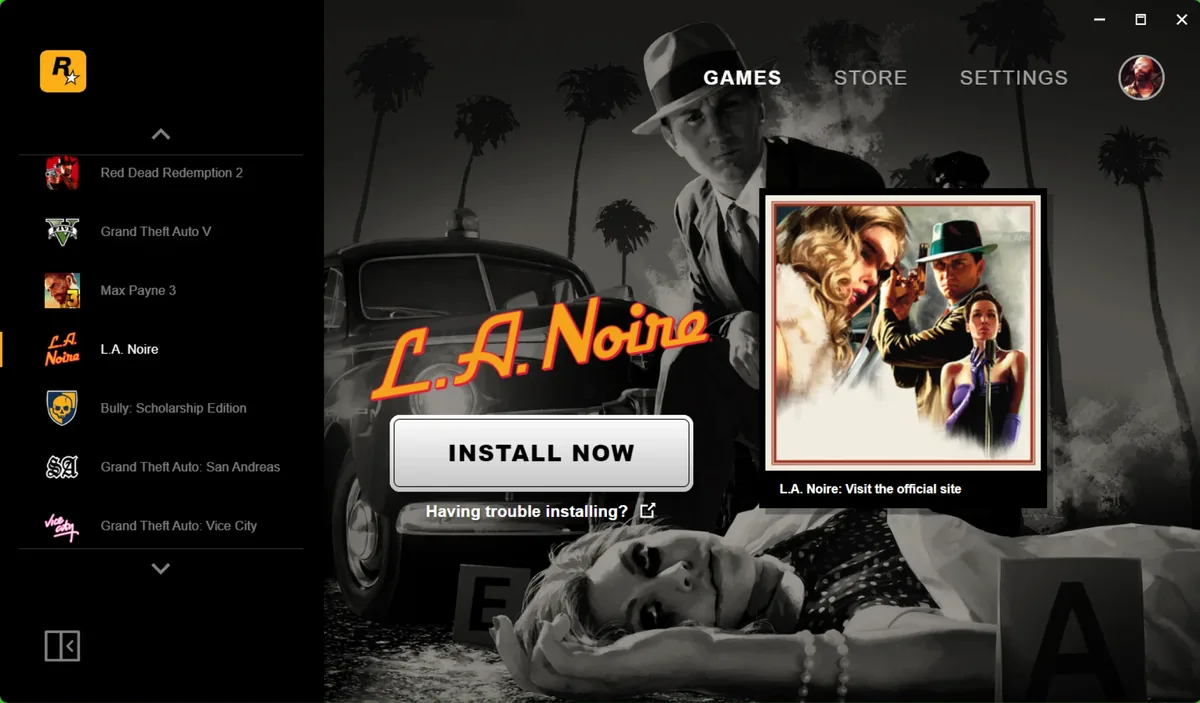
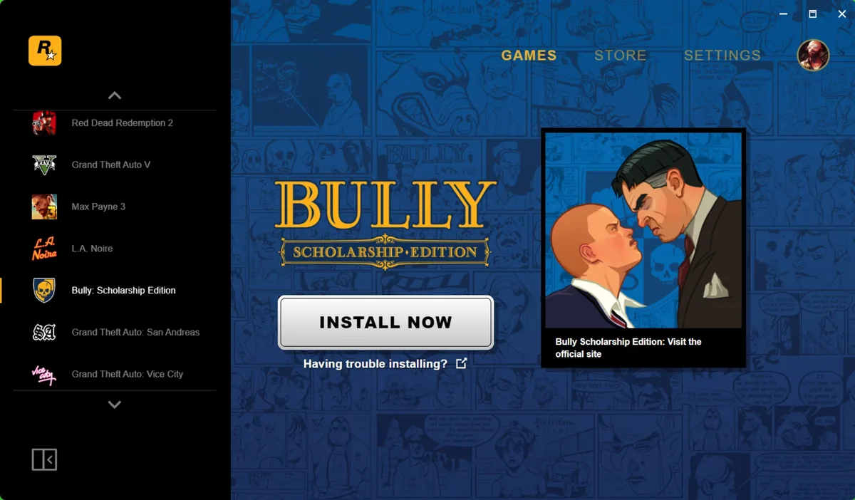
Decision 3: each game gets its own look, and stays readable
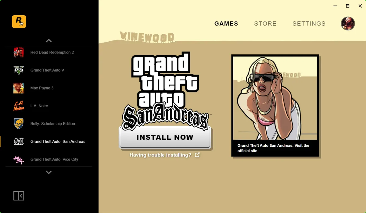
Each Rockstar title has a strong visual identity, and the launcher should feel like it belongs to them. Each game’s page takes on its title’s theme, with text and controls checked for contrast against every theme so the identity never costs readability. Under the hood, every component read its colours from CSS custom properties, so a new title’s theme was a set of values rather than new components. I also asked for new icons across every product, to raise the visual standard to match the best launchers we had benchmarked.
Designing in the material
Because the launcher was built in React, the gap between design and code was small. I exported styling from Figma straight into CSS, reused brand-safe elements from Rockstar’s web projects, and tested and debugged changes in the browser before they reached the app.
- Figma
- CSS exported from the design
- React components
- Tested in the browser
- Desktop app
Testing without the public
Testing with players before launch wasn’t possible. Instead we gathered feedback from Rockstar staff around the world. They asked for the same things again and again: instant access to their library, no pop-ups or ad screens, and a clear interface that felt consistent with the rest of Rockstar. That feedback backed the decisions to drop overlays and keep navigation short.
Outcome
- Shipped in September 2019, giving Rockstar its own route to sell directly to players on PC, without a third-party store’s commission on those sales.
- Six connected pieces designed and built end to end: components, store, payments, downloads, a marketing CMS and sign-in.
- A foundation that has stayed in use since, through major game releases.
- A move from Photoshop and Axure to Figma, and a much deeper working knowledge of React, which shaped how I’ve worked since.
What I’d do differently
Feedback through an intermediary sometimes took weeks. Next time I’d push for a direct line to the product owners and marketing leads early on. The long development period hid the cost of that delay; on a tighter schedule it would have hurt.
The bigger lesson was holding a UX principle under pressure from senior stakeholders, and doing it by offering a better answer to their problem rather than just saying no.