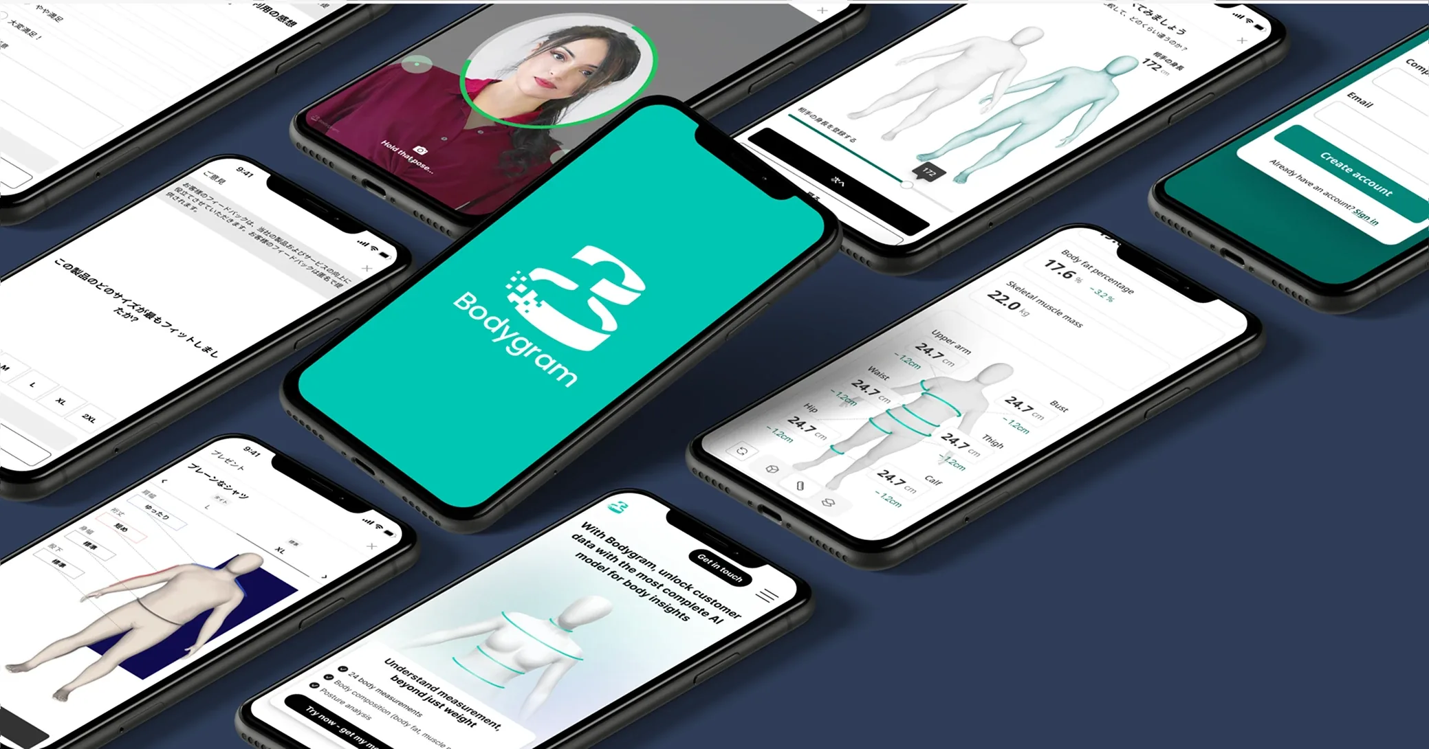
Bodygram · Body2Fit
Turning a multi-screen sizing form into an instant 3D result
Body2Fit recommends clothing sizes inside retailers' checkouts. People had to work through up to six screens before they saw anything. I redesigned it so the result came first.
- Role
- Lead Product Designer
- Dates
- Oct 2024 to Aug 2025
- Team
- Sole designer, reporting to the CEO and Head of Engineering
- Product
- Body2Fit, a size recommendation tool businesses embed for their own customers
- Status
- Designed and prototyped. Not shipped before a company restructure
This work didn't ship, so there is no measured result. It's here for the reasoning: a decision made from the product's own data, and what I would have measured.
The problem
Bodygram is an AI body-measurement company. Its products are used by businesses, who offer them to their own customers. Body2Fit sits inside a retailer's checkout and recommends a size.
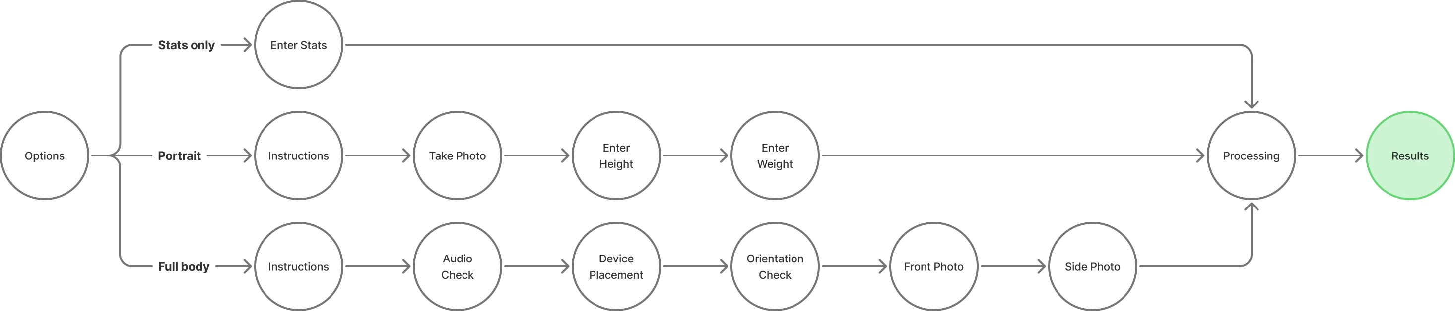
Internal data showed that each extra screen in the sizing flow lost about 1 in 10 users. Depending on the route, the existing flow took up to six screens before anyone saw a result.
Constraints
- Embedded in someone else's product. Body2Fit appears inside partners' checkouts, so it had to respect their branding and the space they gave it.
- Accuracy. A size recommendation that's quick but wrong leads to returns, which defeats the point.
- A small team. I was the only designer, across three products.
Decision: put the result on the first screen
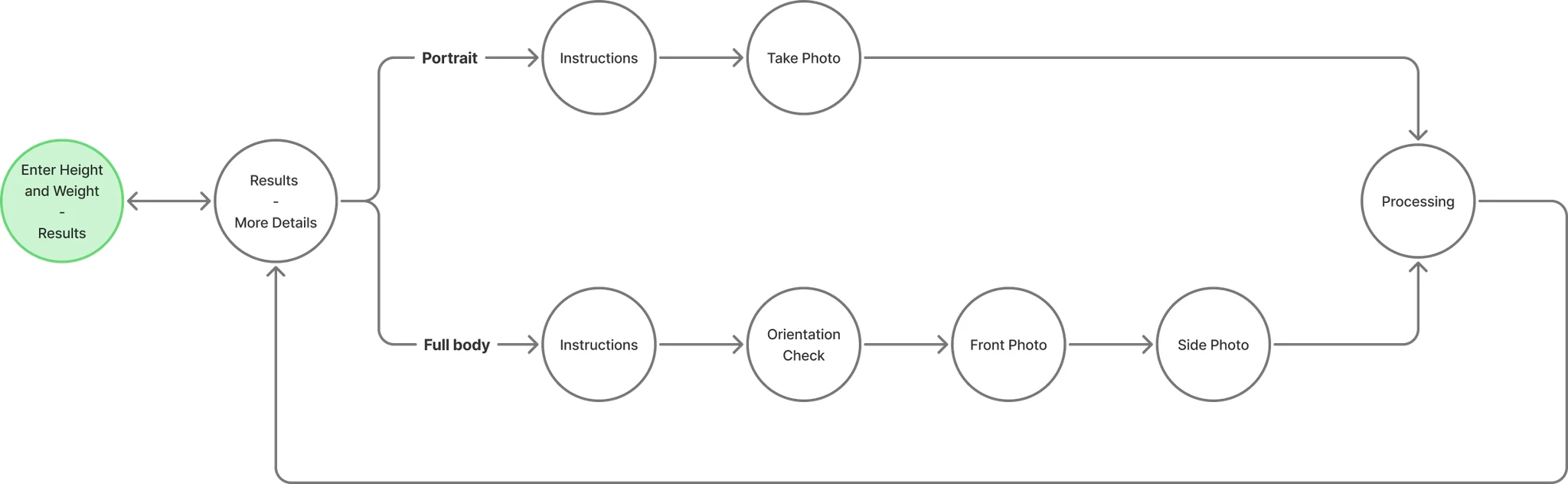
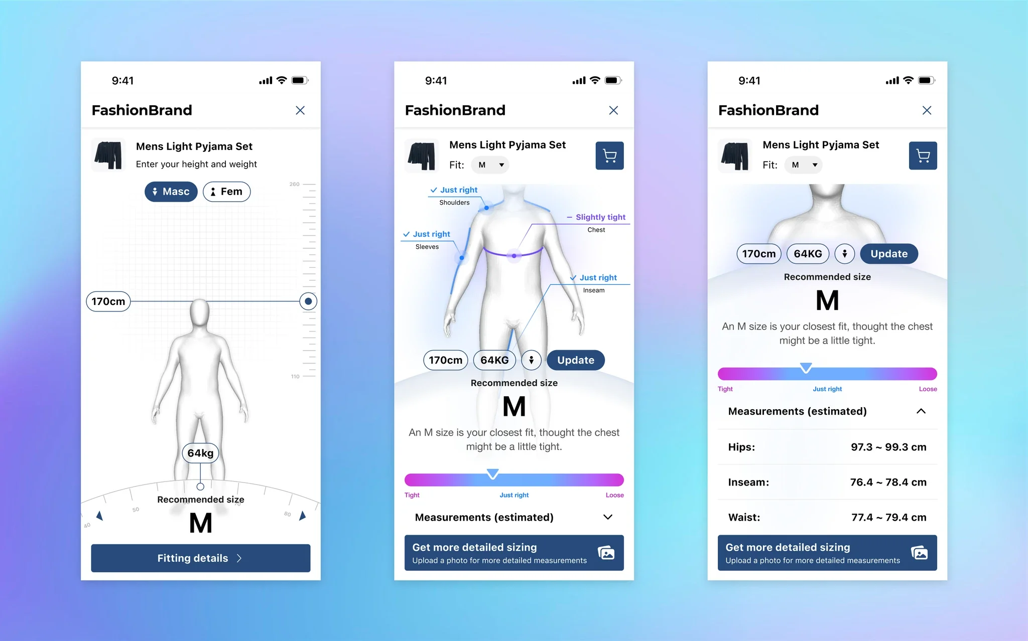
Instead of polishing the form, I changed the order. The first screen shows a 3D model based on averages, with a size already recommended. People adjust it with height and weight sliders, and the size updates in real time.
Fewer screens means fewer places to drop out. And a result on screen straight away gives people a reason to carry on, because every change they make visibly improves it.
Before
After
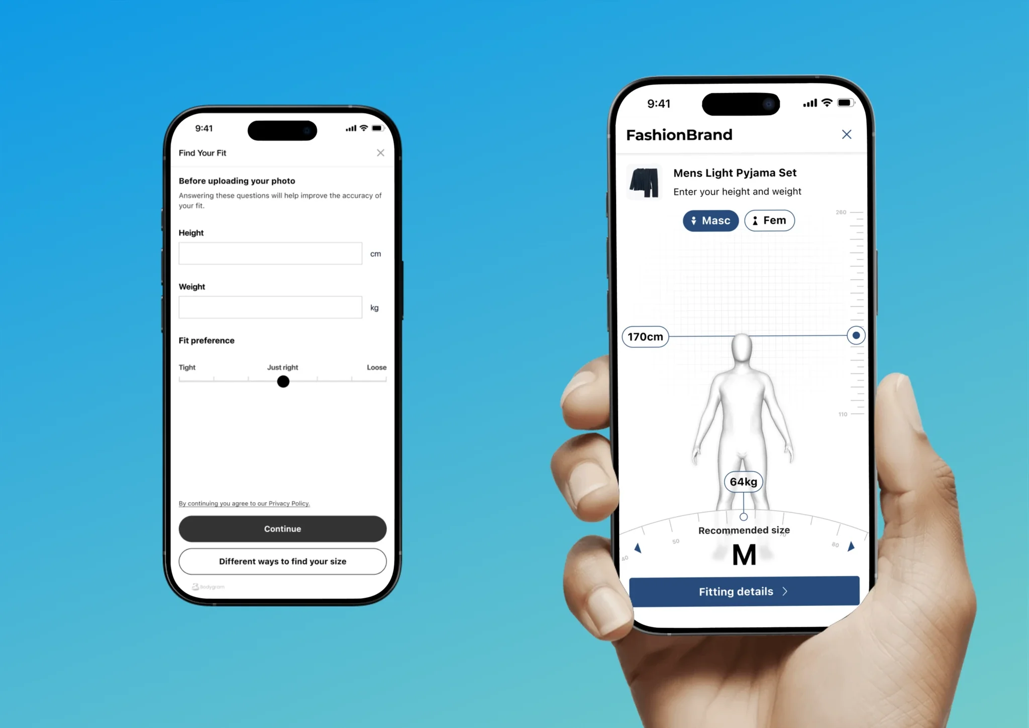
Your size
M
Starts from averages. Adjust, and the size updates as you go.
Designing it as a system
Systems thinking
Most features in this version are built from a small set of reusable elements:
- Shared tokens and elements throughout
- A predictable type hierarchy
- Sensible defaults and clear states
New features could be added without fragmenting the experience.
Brand customisation for partners
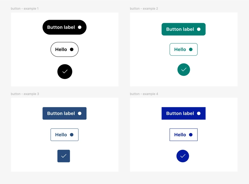
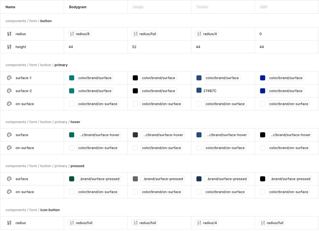
We introduced theming for each client:
- Their own logo
- Primary and accent colours
- Token overrides for spacing, border radius and typography
Fashion retailers could embed Body2Fit in their own sites and keep their brand consistent, while still using our core product.
What I would have measured
- Completion rate: how many people who open the tool reach a recommendation.
- Time to recommendation.
- Size exchanges: whether faster answers held up after delivery.
What I'd do differently
I'd push for a smaller first release that could ship and be measured, such as the result-first screen with only height and weight, rather than the full redesign. A measured slice is worth more than a complete design that waits.